I've been wanting to make something like this to use in my design classes for a long time now: a quick reference guide for visual symbols. If contrast is the key to visual communication, symbols are the vehicle we use to create contrasts and making those contrasts meaningful, like words that make up a sentence, or sentences that make up a story. Having useful symbols at your fingertips is essential if you want to create designs that have a high
propositional density (the link talks about graphic design only; maybe another post on how this applies to visual development later!).
This is not meant to be comprehensive: it doesn't include every meaningful line, or every version of a symbol, or every possible interpretation or meaning of the shapes. These meanings are only the ones I've run into most often (so far), and this chart doesn't include ancient meanings unless those meanings can be found or inferred naturally by a lay person.
That said, I'd love to hear your feedback. If you see errors, have suggestions for symbols that are missing, or think of meanings I should include, post them in the comments either here or on Facebook. I'm considering it an open document and I'll revise as many times as necessary until it's as useful a resource as possible!
 |
| Quick note on the negative context/positive context thing. These aren't just positive vs. negative associations: White text are meanings that will arise naturally in a neutral or positive context, while black text descriptions will only arise in cases where the context skews the way you're viewing that shape. For example: |
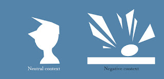 |
| In both examples, the triangles add an element of sharpness and danger to the designs (so sharpness and danger are white in the chart), but the context changes the way we perceive the oval in each. In the left, it softens the character and adds a sense of friendliness in contrast with the sharpness of the triangles. But in the negative context, the sphere appears extra weak and vulnerable. Let me know if that makes sense! |
Large version
here.


